
Designing Your Heirloom:
A Few Gentle Tips
These little guidelines are here to help you feel confident as you design your bespoke heirloom journal. Think of them as a friendly nudge in the right direction, not rules you must follow, just what tends to look most beautiful in person and in photos.
Background
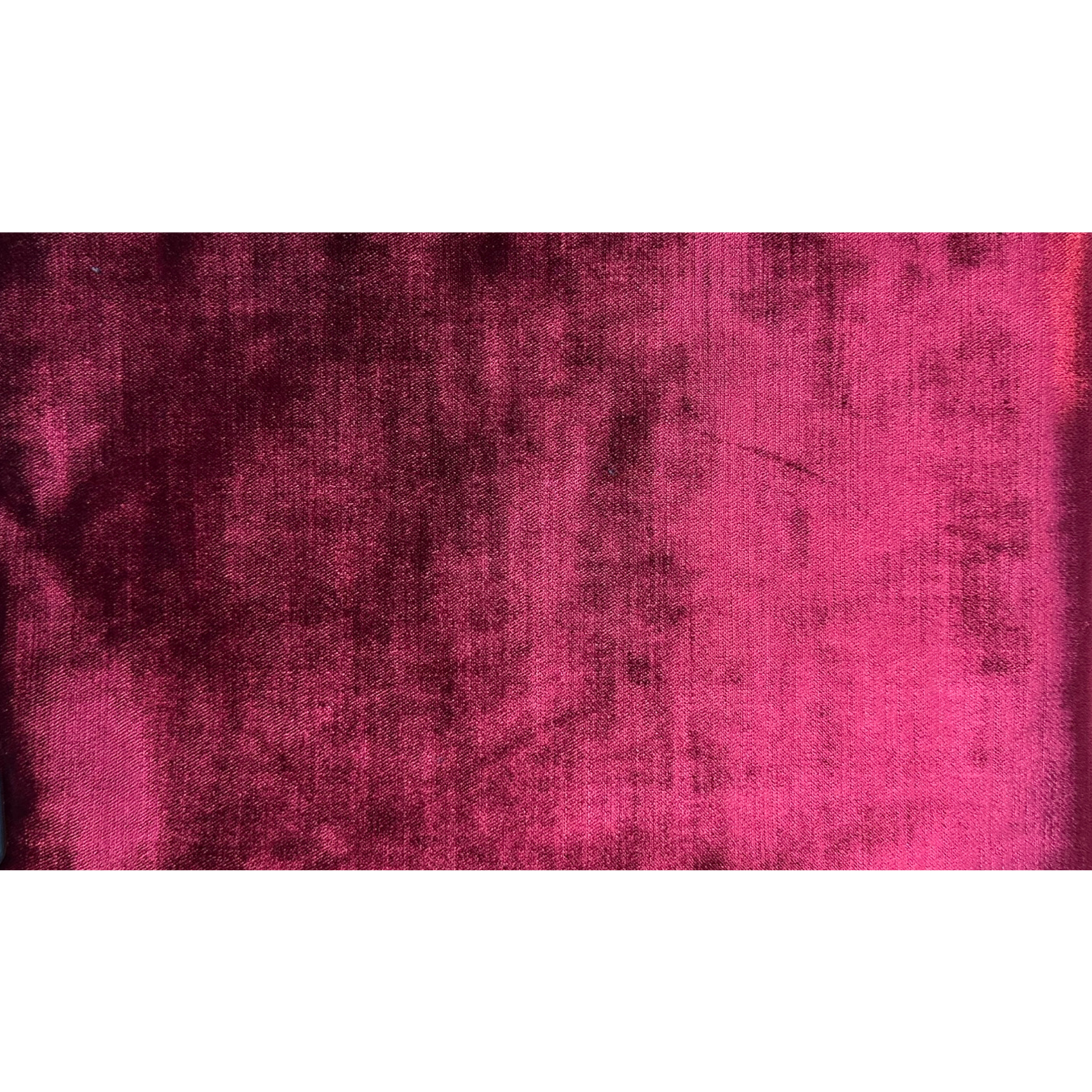
Start with a calm background
Solids or subtle, smaller scale patterns usually show monograms best. When the fabric is quiet, the lettering becomes the star instead of competing with the print.
Thread Selection
Choose thread colors that truly stand out
For your monogram to be easy to see, the thread should contrast with your fabric. Busy prints or similar tone threads can cause the monogram to get lost. As a general rule, think “a few shades lighter or darker” rather than “almost the same.”
Personality
Let the recipient’s personality guide your choices
-
For a classic, elegant feel: choose softer, neutral fabrics and timeless scripts.
-
For a bold or playful personality: consider richer colors or a slightly larger, more dramatic monogram.
Imagine the person holding this journal in their hands, that mental picture is your best design guide.
Script or Block
Script vs. block: pick the mood you want
-
Script styles feel romantic, feminine, and flowing.
-
Block styles feel tailored, clean, and timeless.
If you’re unsure, a simple, graceful script in a medium weight is almost always a beautiful, “can’t-go-wrong” choice.
Big or Small
Think about scale: not too big, not too small
-
On simple or solid fabrics, a larger monogram makes a stunning focal point.
-
On patterned fabrics, a medium-sized monogram often looks more refined and stays readable.
If you’re in doubt, choose “medium” for a balanced, classic look.
Monogram Order
Monogram order: a quick guide
If you’re personalizing with initials, here’s the traditional approach:
-
Individual (three-letter script monogram):
Left = first name, Center (larger) = last name, Right = middle nameExample: Emma Grace Thompson → e T g
-
Couple (shared last name):
Left = one partner’s first initial, Center (larger) = shared last name, Right = other partner’s first initial
Short and Sweet
Keep wording short, sweet, and readable
If you add a name, date, or short phrase inside the journal:
-
Short lines stitch more clearly and are easier to read.
-
Double-check spelling, dates, and capitalization—this is a keepsake meant to be treasured for a lifetime.
Neutral Solids are Safe
When in doubt, choose soft neutrals
If you’re stuck, you can almost never go wrong with:
-
A light or neutral fabric, and
-
A soft, contrasting neutral thread (ivory, champagne, soft gold, charcoal, etc.)
This combination feels elegant, photographs well, and suits any age or occasion.
We are here to help
You don’t have to design it alone
If you’re overwhelmed by choices, you’re not doing it “wrong.” You can always tell us a few words like “classic and timeless,” “feminine and soft,” or “bold and modern” and allow us to suggest combinations that reflect your heart for the person you’re gifting.